As you probably know by now over the last few months RBC has received some funds to support active travel in the borough. The amount of funding received depends on the quality of the schemes proposed but with a certain amount indicated.
In the first tranche RBC unfortunately didn’t get the full indicated amount approved. Some of the schemes from Tranche 1 are now delivered (and in the case of Westfield Road/Gosbrook Road already reversed) and plans for additional ones are becoming available.
The guidelines are clear in that the proposed schemes should reallocate road space to pedestrians and cyclists. Some clearly meet that criterion but there are schemes and sections of schemes where the planners fall back on floating cycle symbols which is somewhat too esoteric to count as cycling infrastructure.
Let’s have a look at the section of the Oxford Road scheme that has now been completed, which is the Tilehurst Section. I know some say the lack of protection is a problem here but in its defence the majority of the scheme from Norcot Roundabout to Tilehurst Station is separated from car traffic which in itself is an improvement. However, there are a few issues with the scheme as implemented.
To start with look at the pinch-point/pedestrian island in the approach to Scours Lane. Currently where you approach this pinch-point the cycle lane suddenly stops and a floaty shows up in the middle of the road.
Pinch-points like this are accident hotspots as some motorists try to overtake you right before they are about to pass it to avoid having to slow down or – they leave you with too little space if they do pass you.
In a situation without a cycle lane you would make sure you position yourself in the middle of the road to avoid this. But the combination of a motorist increasing speed and a cyclist manoeuvring into the middle position at the same time is an accident waiting to happen (see below).
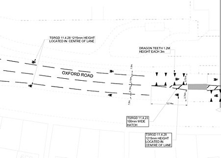
I do believe this is a fixable problem. Either the traffic island is turned into a proper zebra crossing, which would have the benefit of being more friendly to pedestrians, or a section of full segregation in that area could be added.
Even better, you could do both. Needless to say, the floaty needs to go.
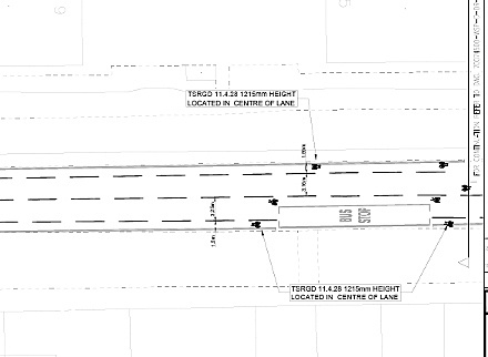
Other areas where more creativity is needed are the handling of bus stops. The cycle lane stops and subsequently cycle symbols suggest you cycle around the bus stop. Of course, the best possible solution is a fully segregated cycle lane bypass that passes the bus stop on the inside.
I get that this costs more money than we have, but what I would say is the symbols suggesting you pass the bus stop are more confusing than they are worth.
If there is no bus you would always go through the bus stop as a cyclist and if there is, you probably want to wait not pass the bus with that little space. And if you do you can do it at your own risk (see below).
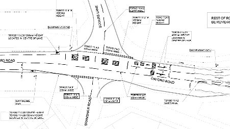
More serious is the junction with Scours Lane. No cycle symbols there but just a sudden stop of the cycle lane. Right at the point it becomes more difficult you are handed over to the traffic into what is an important access for the shops and industrial estate. The cycle lane should continue here to support you.
What it would mean is that all Oxford Road traffic would have priority over Scours Lane and the stop line for cars leaving Scours Lane would be brought back so motorists are less likely to block the cycle lane. There is a lot more you can do (raise the cycle lane for example) but even doing the above would already make a difference (see below).
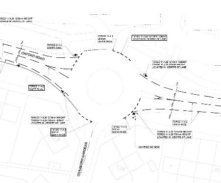
As a Campaign we are very aware that roundabouts are particularly dangerous for cyclists. Unfortunately, the scheme abandons cyclists completely when entering the Waitrose roundabout. The cycle lane just suddenly stops and when you are off the roundabout it begins again. It is not really clear why this is. Painted lines would not be ideal and actual protection would be much better, but they could do better than this (see below).
At the end of the scheme, beyond Tilehurst Station leading out of town there is another section that is hard to get your head around. The road narrows ever so slightly and probably because of this the cycle lane disappears. In its place we now get cycle symbols in the middle of the road again. You get the feeling the planners had an ambition to make a cycle ‘connection’ of a certain length and this is where they ran out of money (see below).
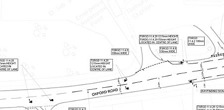
It is a shame because they would have been better off ending the scheme at Tilehurst Station and leaving the rest to do properly when more money became available.
No facilities on Norcot roundabout have been included in this scheme but perhaps they could still add that in when the section from the roundabout to town gets done. I think a lot of the issues mentioned above are fixable in a way that does not mean tearing up the entire scheme. They do require some additional investment and that is where one of the problems is. There is no money for improvements of these schemes ring fenced anywhere so it will be hard to get improvements done.
My other worry is that the plan for the remaining section of Oxford Road is also full of floating cycle symbols and dead ends and that stretch is also a lot busier and challenging so getting that wrong could result in bigger issues than the ones highlighted above. But let’s hope for the better!
Leendert van Hoogenhuijze
RCC Publicity Coordinator


The new painted lanes are ridiculous. Te previous on-pavement mixed lanes were perfectly adequate and much safe. The new paint lanes are a waste of money and should be removed to clearly reinstate the on-pavement mixed lanes.